
Your search engine optimization and social network campaigns will become useless if your landing page fails to convert your target audience. These welcoming sections must provide enough information to satisfy the curiosity of audiences. It must also urge them to consider purchasing and be led to the third marketing funnel level: conversions.
Companies will expect custom landing pages to perform better than their initial home pages. Designers are knowledgeable when it comes to creating these viable assets. However, it can take a few more adjustments on these five areas after each revision to make a high-conversion landing page.
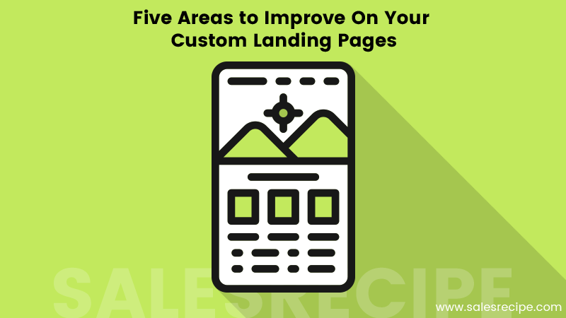
Five Landing Page Sections to Keep in Mind
Page Headlines
The call-to-action button is initially noticeable on a landing page. However, the headline urges audiences to press the button because of its informative content. The headline and advertisement must give a small description that introduces a small amount of hype about the product or service.
A well-written headline can have a single or two short sentences that do not go over 15 words. You can use headline fonts depending on your brand. A corporate website will want to use clear and readable typefaces and concentrate strongly on using minimal visuals to keep their audiences attention where it is relevant.
Custom products, youth-oriented services, and small businesses are advised to use clear and readable fonts with a distinguishing factor. These typefaces can look like fonts used on a signboard. However, making them part of the background or similar to digital content also makes them easily noticeable.
A great example of how headlines introduce a sense of urgency is CNN’s landing page. The large font size and attention-grabbing title makes it irresistible to readers.
Attractive Call-to-Action Buttons
All CTA buttons must contrast and stand out as the most prominent on the landing page’s visual hierarchy. The action word or phrase printed on the button must urge action. It is advised that these buttons are attention grabbing and has perceivable effort given to its creation.
Attractive buttons can look flashy or glossy, as most effective landing pages use. They can also be unique; to get attention, they can have some sort of animation such as shaking.
Top-performing CTA buttons often emulate real-world buttons or objects. For example, on a voucher code service’s landing page, a code-concealing material that appears to peel off partially from the number panel will urge any viewer to have a strong urge to click it.
High-Quality and Relevant Images and Photos
Landing pages with high-quality images and photographs for advertisements of any kind retain the strongest audience attention. It is advised that you invest in royalty-free graphic design and photography where necessary when customizing your page.
High-resolution photographs of your products and services will always get the most attention. Native advertising that shows the product or service in action can urge consumers to consider a purchase. You can utilize native advertising in many ways.
However, make sure that you manage your site’s bandwidth when using high-resolution pages. Luckily, most designers are knowledgeable about the optimal viewing resolutions that allow them to reduce the memory footprint of the media they use in your landing page. E-commerce sites, particularly Amazon and Aliexpress are great examples of low and high-resolution photo usage on landing pages.
Aside from images, you can also use videos hosted on your site or embedded from YouTube and other streaming sites. A how-to video on using your products or maximizing your services will always gain great attention from visitors and can strongly urge them to buy into your offers.
Less is More
Custom landing pages must utilize white space or solid colors effective. For most e-commerce sites, a white background helps highlight the finer details of the products it offers. Landing pages can use other solid colors aside from white.
If simplicity is the focus of a landing page’s visual hierarchy, then the most detailed element will receive the highest attention. This will be your call-to-action button. Your large headline font is next. The last one is the sub-headline, which can add further information about your products or services. Here is another great example: Site builder service Wistia’s landing page.
Use minimal text and short sentences on your landing page. Only introduce elements with solid colors. In fact, an advisable and effective design principle to follow is to make the page simple enough for a fifth grade child to use.
Always Test and Ask for Revisions
All improvements on your custom landing pages will be useless without having a test audience view and illustrate their experience. A/B testing is crucial because there is no perfectly-designed landing page without a few revisions and modifications. Tests allow you to discover whether to add further information on headlines, if your CTA buttons are working properly, and if the landing page gives a subliminal impression of your brand.
Designers of custom landing pages often limit their revisions per client or depending on the latter’s service package. Maximize your revisions, but make sure each one counts by collecting enough data from situational tests. In this way, you can ensure your investment will return quicker than you expect.